As you know, taking stunning pictures is one of the keys to success on Etsy.
Here are some interesting and effective tricks to improve your photos!
Your product is the
focus!
In this section we are going to discuss “staging” your items
for your photo shoot. The first thing to consider is the background. No matter
what your product is, your product is the most important and first thing you
want your customer to see. (I will note here that sometimes the creator wants
an artistic look that isn’t necessarily focused on the product; however, we are
not going to tackle that here. There has been much discussion between Etsians
about the use of a white background for photos. Many people feel that Etsy
seems to favor white as the background of choice for treasuries that gain the
front page. That may or may not be true, but a crisp, clean, uncluttered
background is what you want to achieve. Remember the star of this photo shoot
is your product.
 |
| Umbrellafant |
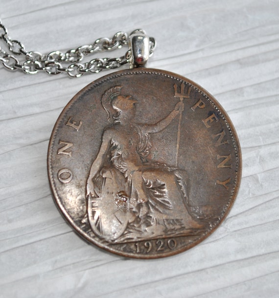
Consider the background
Don’t let the texture or color overwhelm your product. Fuzzy
rugs, fluffy bedspreads, shiny and/or wrinkled fabric don’t look professional
or accent your product. Make sure your background color complements your
product colors. You don’t want the
background to compete for attention. Try to choose a color or look for your
background that puts your product in the best light. That might mean that if
your item is very colorful or intricate that a solid color background is best.
 |
| Umbrellafant |
There are many things to use for a background, lots of small
items can be photographed on a piece of tile, stone, barn wood, or scrap booking
paper, (I like to look for white papers with different textures)
If you have a larger
item, hang a stiff canvas cloth behind it, even a blank wall that doesn’t
compete will work. It’s okay to take pictures outside if your item is the focus
in the forefront and the objects in the background fade away.
Don’t be afraid to look at other shops and get ideas!
 |
| Beechtree |
Represent your work!
If you have an
unusual item, perhaps you want to add something in the picture to help
reference it. An example might be if
you make cake toppers you might want to have a cake in the photo as well as
your product. Remember you have 5 photos to use, choose the most informative
photo for the feature photo. Think of it as having 5 photos to tell the story
of your product. Remember when a person is shopping in a brick and mortar
store, they will look at the top, bottom, inside, closure, size, seams,
workmanship, etc. Make sure you use all 5 photos to sell the critical
components of your item.
Evoke a Mood
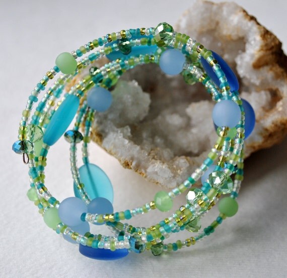
Some Etsy sellers want to evoke a mood with their photos to help sell their product. An example might be if you are selling beach glass jewelry, besides having good close-ups, use of sea shells for props will look great and remind the shopper of a day at the beach. Colors that are considered to be “beach” colors such as pastel blues and greens would be a good choice, Vintage sellers often want to set up photos to look like a museum display which evokes antiquity with their product the focus. Showing a product in use always to help tell the story.
 |
| Thread Design Studio |
What kind of mood are you trying to set? Choose props that
tell that story!
 |
| Foxberry Hill |
 |
| Beechtree |
 |
| Cocodollz |
Use of White Space
White space, many times referred to as negative space, is the portion of a photo that is left blank, the empty space in a photo. It doesn't have to be white to be considered as empty space. Negative space will draw your viewer’s attention to a product. When you separate your subject from a cluttered background you are simplifying your image, thereby making it more compelling.
Get chosen for
treasuries!
Treasuries are a
great way to be featured and get your products noticed. If you have great
photos, not only will you have increased sales but you will find your products
featured more by treasury makers. A treasury maker is looking for beautiful,
clear artistic photos. If you have lots of text on your photos like clearance,
sale, trademarks, etc. chances are those photos will not be chosen.
In Closing
When a buyer sees professional looking photos that look like
thought and care has been taken to best display the product, they get the
message that the product must be made with great thought and care as well.
Etsy: www.etsy.com/shop/Beechtree
Website : www.beechtreedesigns.com
Facebook : www.facebook.com/BeechtreeDesigns
Pinterest : www.pinterest.com/dalgat
* * * * * * *
Take a look at some of our previous articles about photography :
- How to Take Beautiful Photos of your Handmade Items with a Lightbox!
- How to Edit your Photos with Photoshop (after using a Lightbox)
- How to Edit your Photos with Photoshop (after using a Lightbox)
PRESENTED TO YOU BY OUR LEADER:
Hi, my name is Tara and I am a recently retired Speech/Language Pathologist with 2 grown children and one grandson (and another on the way!) I share my home with my husband and 2 big dogs.
I have been passionate about creating in some form or another all of my life. Our family has always enjoyed our time at Lake Michigan and love to collect Petoskey stones and other fossils and stones. When I discovered jewelry making I finally found my niche for creating beautiful pieces that I can share with others. Each piece I create starts with the stones themselves and then it just seems to flow from there. I have collected gemstones and beads from everywhere I travel and always can’t wait to get started with the new treasures. I hope you enjoy my shop Beechtree and will find a piece that speaks to you and brings much joy. |
Etsy: www.etsy.com/shop/Beechtree
Website : www.beechtreedesigns.com
Facebook : www.facebook.com/BeechtreeDesigns
Pinterest : www.pinterest.com/dalgat


Tara! Great post! Thanks for sharing.
ReplyDeleteWonderful, easy to follow advice, Tara, thank you for sharing here! This is such an important element to our shops, it's always good to learn something new in this area and be reminded of the importance of good photos.
ReplyDeleteVery informative and interesting post !
ReplyDeleteTara, thank you for this article and photos. Very interesting and useful information!
ReplyDeleteThis comment has been removed by a blog administrator.
ReplyDeleteThis was really interesting and helpful article!! Thanks for all the wonderful tips!!
ReplyDeleteBeth from Pretty Byrd Designs
Thank you for these tips. I'll keep them in mind for when I take photos for my shop.
ReplyDeleteLovely article - Thank you :<)
ReplyDelete